Slowing the scroll
Context over completion
It’s been a around 5 years since I’ve tossed all social media off my phone. Instead, I kept long-form apps like Wikipedia, Substack and now feeeed. It worked great. Until I realised my fingers and eyes haven’t understood the assignment yet.
My scrolling and scanning is still as frantic as it is on social media. It’s short-form behaviour for long-form content. My attention span needs a rehab from time to time. I wonder what a different scrolling paradigm would look like.
To aid how we read, what if text rendered itself at the natural human reading speed? Based on what I’m looking at and where I am on the page, the text in the viewport could render line by line.
The rest of the text? Stays hidden until you give it your attention.
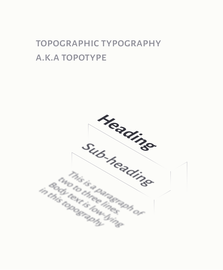
Notice how the text in the other parts of the page stays hidden until it's given the time. The larger headings stay exposed and visible, as a signpost for what the section is about. So typography is treated as topography, and to really get a feel of the terrain, you'd have to walk through it.
Now, this is just a musing on healthy friction and guided reading. Something like this would have to be configurable to the user. Maybe a modification to reader modes that exist in most browsers?
Also, this most likely doesn’t account for how actual reading behaviours work, where people skim through columns of text to get an idea of its context. My question here (mostly for me) – is it enough context?
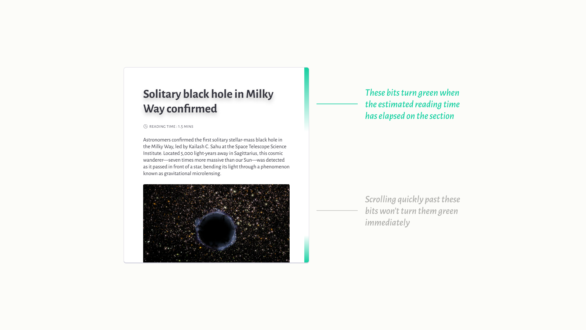
In this sort of paradigm that values context, a scroll indicator wouldn’t just be a mark of how much content is remaining on a page. Turn that into a progress indicator of sorts, and what if it could reflect how much of a page you’ve actually seen and spent some time on?
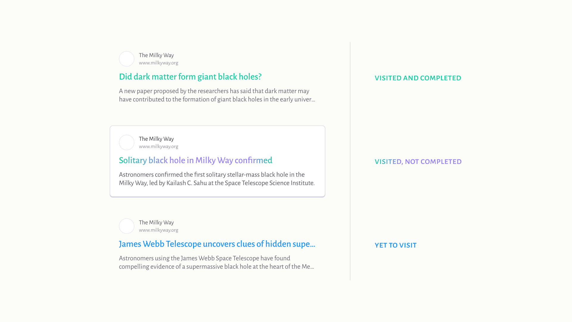
Going a bit further, what if we could encode this ‘progress’ into links? We already have two semantic colours for fresh and visited links. Could a gradient offer cues for revisiting links to complete them?
If context is really what we’re valuing here, as a slice of space and time, how can we bridge the rest of the gaps before and after this text? In other words – what do I need to know before and after reading this text?
Could a set of new swipe down/up interactions trigger a search and summarisation, using the text that’s in an article? This could reveal some quick need-to-knows and follow-ups.
What would a browser, document reader or even a social media platform look like with these information-discovery patterns?
Some limitations I can think of, to all these ideas :
- This could make the surface-level reading problem worse, giving people less of an incentive to dive into the details.
- Is this going to be difficult for screen readers?
- When writing flows, you can’t forcefully chop that up into sections. Is this going to make the author’s job harder?
- Who do we assign the swipe-up/down context-building to? Would it be an AI-powered search engine?
These experiments started because of fleeting frustrations with my screen time and my attention span. I thought different platforms could offer these new paradigms, but a couple of newsletters and apps later, I found myself wishing for more friction and intentionality in the way we’re presented with information itself.
Amelia Wattenberger’s own ideas on fish-eye lenses for text were very influential for these sketches.